So readers,
Hope you are aware of Google I/O Conference 2014, an interesting look
out for every tech enthusiast. Along with release of certain entities,
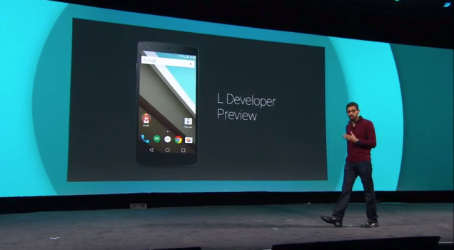
we also saw the release of the most awaited preview of Android L! Yes,
the most exciting news developers & Nexus Owners.
With every release of Google's New Android Version, we saw'em talking about devices' processors, etc. Talking straight, we saw them emphasizing of the features. But this time, Google discussed about it's design.
Say like, we've been using cellphone since 90's, at the time of black & white phones. But the release of "Apple's iOS & iPhone", had been the revolution in field of 'Touch Screen' & 'Sensors' supporting Smartphones.
Since years, Android and iOS had been the vast competitors in field of Smartphones.
Google's open source 'Android', is loaded with many features in it's own form. Also, it has been edited by manufacturers, topping it with personalized UIs to give their own flavors.
Third-party App have been the most liked and settled up form of application over last few years. With artificial and online SDK's, the innovation is no more difficult, but to create a actual real feature, it is a way hard task!.
Apps and all other kinds of cell phone feature are being gradually homogenized. Third-party softwares are also in the same queue. The only way to improve user experience is by constantly focusing on the device’s design.
This time, they Google finally dropped the design style used by engineers, and has worked painstakingly to design the public version. Improvements have been made in regard to colour schemes, fonts and animation transitions. These changes are implemented in expectation of providing users a new and satisfying experience.
The question is still not clear, relatively to the answer. For improved apps (the ones' being the right selected over previous ones), the developers need to use the same components again & again?
With the introduction of 'Google's new Design', the developers & manufacturers need to focus on the new way, to adjust 'their' introduction of apps & U.I.s according to the new product.
Hope, this might bring a stroke of change and something new, because, keeping apart the previous android versions, the design had always been the same.
SOURCE : TN
With every release of Google's New Android Version, we saw'em talking about devices' processors, etc. Talking straight, we saw them emphasizing of the features. But this time, Google discussed about it's design.
What does this mean? Emphasis on 'design' rather than 'features'?
1. It's never been and is not easy to bring about new features, etc.
Say like, we've been using cellphone since 90's, at the time of black & white phones. But the release of "Apple's iOS & iPhone", had been the revolution in field of 'Touch Screen' & 'Sensors' supporting Smartphones.
Since years, Android and iOS had been the vast competitors in field of Smartphones.
Google's open source 'Android', is loaded with many features in it's own form. Also, it has been edited by manufacturers, topping it with personalized UIs to give their own flavors.
Third-party App have been the most liked and settled up form of application over last few years. With artificial and online SDK's, the innovation is no more difficult, but to create a actual real feature, it is a way hard task!.
2. In the era of Homogenization, design is the best competitive strength.
Apps and all other kinds of cell phone feature are being gradually homogenized. Third-party softwares are also in the same queue. The only way to improve user experience is by constantly focusing on the device’s design.
This time, they Google finally dropped the design style used by engineers, and has worked painstakingly to design the public version. Improvements have been made in regard to colour schemes, fonts and animation transitions. These changes are implemented in expectation of providing users a new and satisfying experience.
3. Design: The Ultimate Challenge!
The question is still not clear, relatively to the answer. For improved apps (the ones' being the right selected over previous ones), the developers need to use the same components again & again?
With the introduction of 'Google's new Design', the developers & manufacturers need to focus on the new way, to adjust 'their' introduction of apps & U.I.s according to the new product.
Hope, this might bring a stroke of change and something new, because, keeping apart the previous android versions, the design had always been the same.
